Main screen
Once you are logged into the application, you will see a screen similar to the following one. This could vary from one implementation to other since your product could be customized or your user could have a limited feature access.
Example of main view in browser version
Initially, your layout will be arranged into two different sections, being the left one, responsible for interaction and use of the application by the user, and the wide blank section on the right, the working part of the app. This last part will be used by the different tools to handle chats, calls, settings, panels, etc. On mobile version this section will be hidden if it is currently inactive.
The view in the mobile version is a bit different as only the left panel is shown:
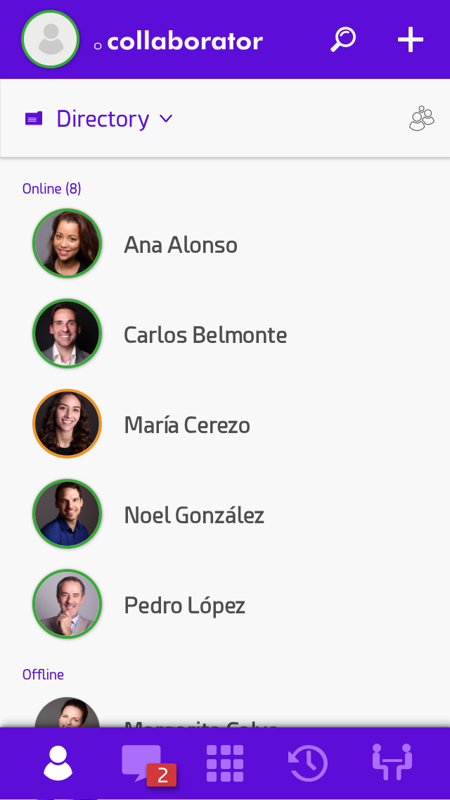
Example of initial view in iOS
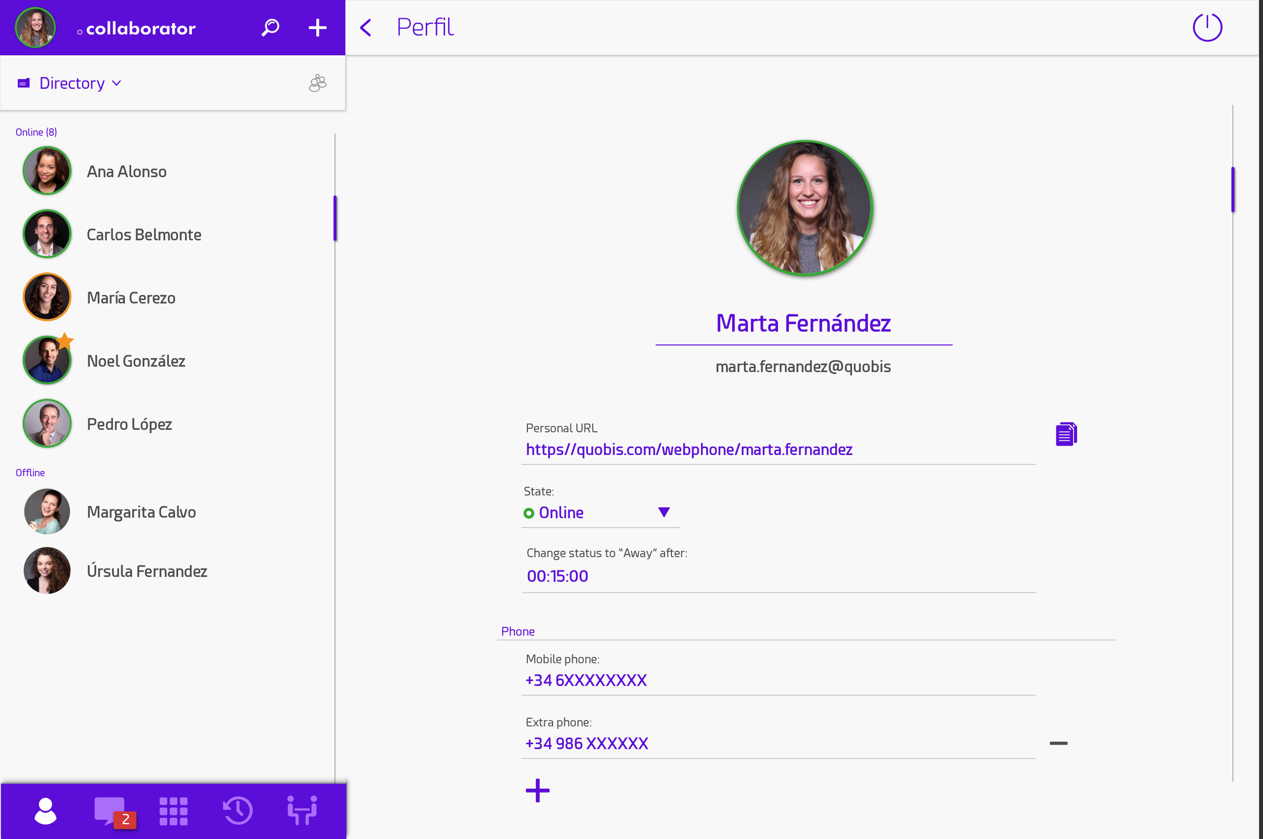
Focusing in the left panel, on the top is the main title where you will find:
The name of the panel.
Your username.
Your profile photo.
Below this header is a toolbox ribbon with:
A searching area to explore through the elements displayed.
A
 to add extra contacts
A
 to filter contacts by favorites only.
In the middle is located, as a big white section, the contacts area, which we will refer to later. This panel will change based on the tool selected on the bottom. A navigation bar is displayed at the bottom where we can choose between the different tools, from left to right :
agenda
Alerts (iOS only)