Branding
Quobis collaborator colors, logos, icons and fonts can be changed according to the look and feel requirements of the customer. This branding configuration needs to be done by the Quobis support team and it’s not exposed to the administrators, so it cannot be changed neither by the partner nor by the end-user after the application is compiled and installed. This page explains what branding options are available, its limitations and how to provide the branding information to the Quobis operations team.
Color branding
The colors of Quobis collaborator has been choosen according to a color palette.
Collaborator’s palette has been defined to achieve accessibility, readability and fluency in the conversation experience. The platform joins the clarity of light theme, which helps the reading and follows user patterns; and the dark theme, which focuses and relaxes view as the communication platform standards does.
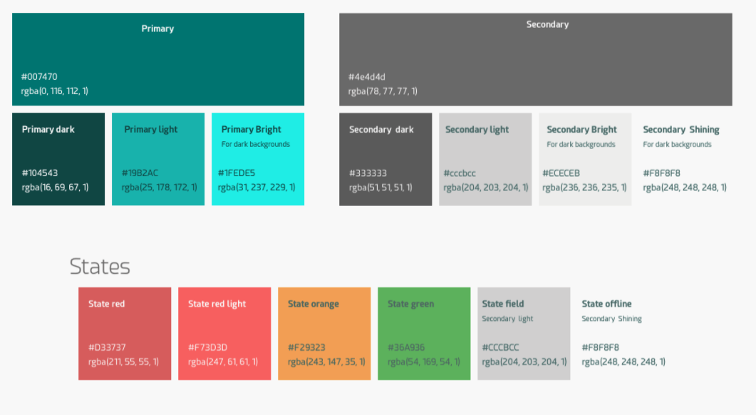
The Quobis collaborator palette has been built around two main colors, defined as “primary color” and “secondary color”. Primary color rule is to highlight elements in the interface, i.e. to accent active navigation elements, editable fields or stressed text. On the other hand, the secondary color is used all over in a neutral sense, in the opposite cases: in main background areas to contrast with content, in texts and in less important elements. Each of these colors has its own variations, such as “dark”, “light”, “bright” or “shining”, which are used according to the background. The default Quobis collaborator palette is shown in the following image:
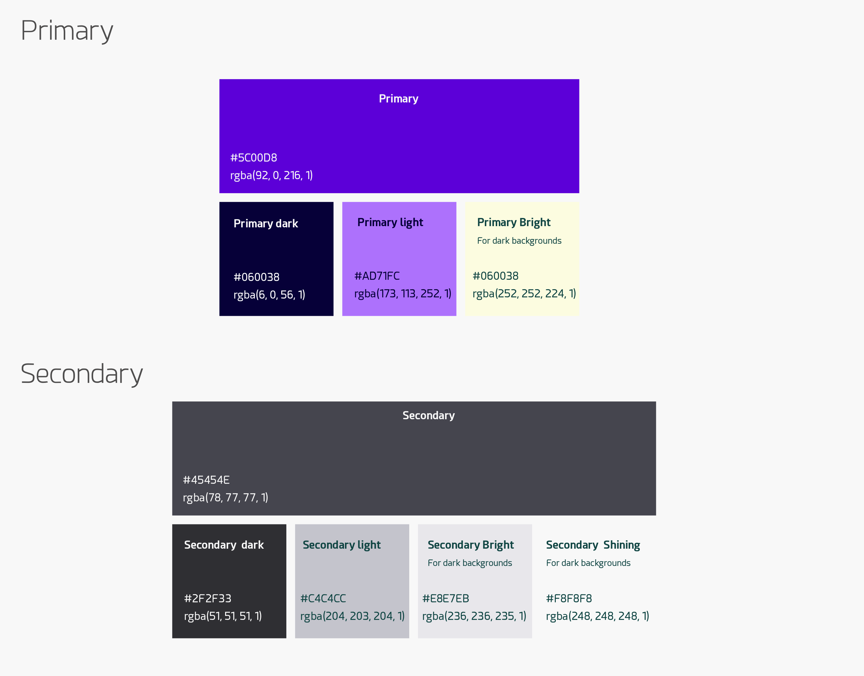
This is an example of another palette using a different color set:
Quobis collaborator design has been structured in a way that several elements share the same colors of the palette in order to provide a structured view. As an example, the upper bar and the footer bar will always have the same color. Thus, changing the values of the palette has implications on a number of different elements across the different screens of the product. Since version 4.3, the palette values can be changed in order to match the specific branding or your company, proving you the ability to customize the Quobis collaborator look and feel to your corporate branding. The example below what happens when you just change the value of the primary color of the palette:
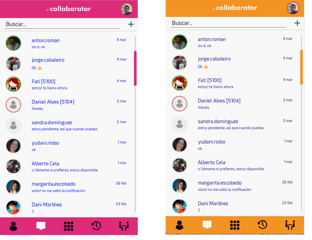
Example of color change by modifying the “Primary color” in the palette
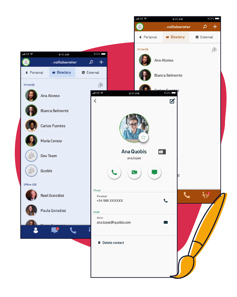
Quobis collaborator for Android and iOS devices can also be branded following the same pattern, as shown in the image below (iOS example):
Note
Please note changing the color of an specific element may not be possible wihout affecting other elements that use the same color in the palette. For instance, the color of the “answer” button is set to the primary color and the color of the hangup button is set to “status-danger” color and cannot be further customized.
How to test the palette
Your UX team needs to decide which primary and secondary colors to use in order to match the branding of your company, taking into account that changing the palette values affects several elements across different screens. It is a cumbersome process to explain in detail which elements use a specific color of the palette, so we provide you a visual tool to help with the color selection.
We will make use of the Chrome DevTools CSS function, which allows you to change the CSS properties of any website and see the result immediately. In order to see the effect in a permanent way, we’ll make use of the Local Overrides functionality that lets you make changes in DevTools, and keep those changes across page loads. By using this function, you can change the color palette “on the fly” by modifing the CSS values of the “color” variables and see the result in real time.
First, navigate to your Quobis collaborator URL with a Chrome browser and log in. If you haven’t installed it yet, you can ask your Quobis support team for a demo version and work with this one.
Next, you need to setup “Local Overrides” into the Chrome DevTools:
Open the Chrome DevTools by left-clicking and select “Inspect”
Open the Sources panel.
Open the Overrides tab.
Click Setup Overrides.
Select which directory you want to save your changes to
At the top of your viewport, click Allow to give DevTools read and write access to the directory.
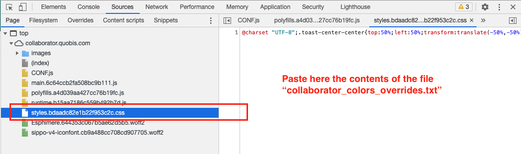
Now, copy the contents of this file collaborator_color_overrides.txt to your clipboard.
Then, select the CSS file whose name starts with “styles.baadec” and, once selected, paste the contents of the clipboard into the edition area, right below the first line as shown in the image below.
File to select in the “Page” tab
The result must look like the screenshot below, please note that it might take a few seconds as Chrome process its contents in real time. In this edition area, you’ll be able to change the values of the color palette by modifying the HTML color value and see the result in real time in the left area. There is also a color picker to make the selection easier. Please only change the values in the upper areas as instructed.
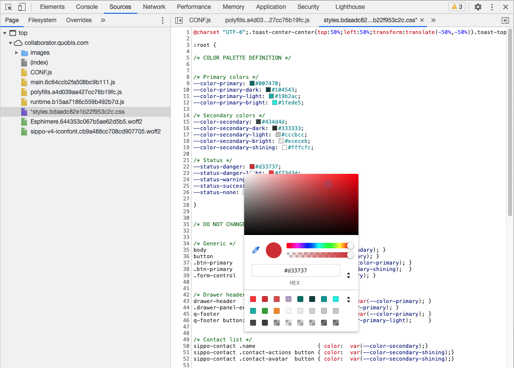
Result after pasting the clipboard text into the CSS file
The example below show how it works in action and how the colors of the application changes while you change the CSS values of the palette. Once you are happy with the result, copy the contents of your new color palette (the lines above the “Do not change below here”) and share it with the Quobis operations team, so they can build the application using your palette.
Play the above video to see an example of color branding using the Chrome Dev Tools
Once you´re happy with the result, you just need to share with the Quobis team the values of the color palette. Please do that by filling a txt file with the following format. The Quobis team will integrate your palette into the building process and the Quobis collaborator app will have your branding.
 1//Primary color
 2$color-primary: #007470; <-- put here your selection
 3$color-primary-dark: #104543;
 4$color-primary-light: #19b2ac;
 5$color-primary-bright: #1fede5;
 6
 7// Secondary Color
 8$color-secondary: #4e4d4d;
 9$color-secondary-dark: #333333;
10$color-secondary-light: #cccbcc;
11$color-secondary-bright: #ececeb;
12$color-secondary-shining: #f8f8f8;
13
14// Status
15$status-danger: #d33737;
16$status-danger-light: #f73d3d;
17$status-warning: #f29323;
18$status-success: #36a936;
19$status-none: #f8f8f8;
Additionally, if you don’t feel confortable with the result in the action buttons (primary and default), you can also change its text color and background color to one of the above color variables (for example, you can change btn-primary background from var(--color-primary-light) to var(--color-primary-dark)). Please indicate it to the operations team.
Customization beyond the color palette
If your branding needs exceeds the possibilities that we have described here by using the color palette scheme changes, please get it touch with your sales manager to request a full CSS customization. Please note that this will require professional services.
Icons branding
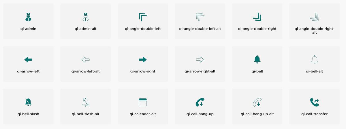
Quobis collaborator has a set of around 50 different icons that are used across the application. These icons can be changed by the Quobis support team and included in the compilation of your Quobis collaborator installation. A selection of the icons is shown below just for illustration purposes:
If you want to change the icons and provide your own set, please download this TTF file sippo-v4-iconfont.ttf and replace the standard icons with the new ones. Once you’re done, please send the new version of this file to the Quobis support team.
Logos and images branding
Quobis collaborator logos can be changed by the Quobis support team and included in the compilation of your Quobis collaborator installation. These are the logos that you need to take into account:
Login screen logo: this is the logo that appears in the login website
Header logo: this is the logo that appears in the header of every screen
Favicon logo: favicon logo for the browser tab
Desktop logo: logo that is used in the desktop applications
Apps logo: logos used in as app icon, Callkit menu for iOS devices, etc…
In addition, the help images that are displayed as a background in the right panel can also be customized (eg: image meeting-content.png as long as its size it’s not changed.
If you want to change these logos and images, please generate your own ones following the provided ones in file images_collaborator_browser_4.3.zip as an example. Once you’re done, please send the new version of this file to the Quobis support team.
Fonts branding
Quobis collaborator default font (“Esphimere”) can also be replaced with your own font set. If you want us to include your own fonts, please provide a file with the font definition in a TTF file. The fonts used can be downloaded from here: Esphimere normal and Esphimere semi-bold
Sounds branding
Quobis collaborator sounds can also be replaced with your own audio files. Just download the attached sounds.zip file and replace the files with the ones of your choice, according to the list below. Please note that the file format must be MP3.
busytone.mp3: played when the remote party is busycalling.mp3: played when an incoming call is receiveddialTone.mp3: dial tone used in SIP interconnectionin-call-ringing.mp3: played when an incoming call is received during an active callmessage.mp3: played when a new chat message is sent or receivedringing.mp3:DTMF-0.mp3(up to DTMF-9): DMTF tones 0-9DTMF-hash.mp3: DTMF sound for the # keyDMTF-star.mp3: DTMF sound for the * key